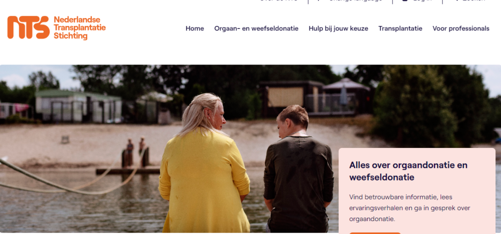
The Nederlandse Transplantatie Stichting (NTS)
Under supervision of the Ministry of Health, Welfare and Sports, the NTS supports hospitals and other medical centres that are dealing with transplantations and donations of organs and tissues. This is a pretty clinical description though. In reality, it is all about people.
Target audience: everyone
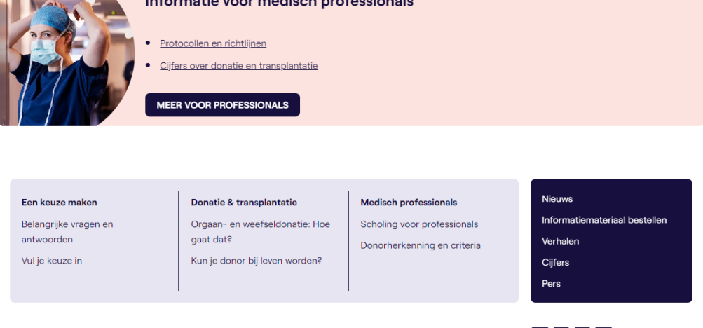
The NTS shares knowledge about the donation and transplantation of organs and tissues. Whether you are a doctor who needs to find information about certain medical procedures, a 10-year-old who wants to make a paper for school, or a patient on the waiting list for an organ: literally everyone should be able to find information on this website.
Oh, and there is also an impressive number of volunteers involved. Most of them have received an organ or tissue from a donor. They know what it is like to be on that waiting list and are ready, willing, and able to share their personal experience with whoever wants to hear it.
Let this sink in for a moment. Usually, there are just a couple of target audiences involved, and most of the time those groups are somehow related. The NTS is there for every single Dutch citizen.
Is that even possible on one website?! Yes and no.
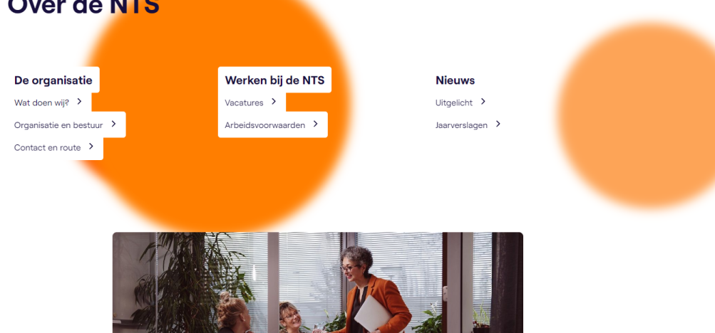
Yes. You’ll be surprised. The keyword for being able to address an audience that large is information architecture. You just have to take the time to structure a vast amount of information. If you don’t, the website will become a maze, visitors will get lost and give up because they can’t find what they are looking for. Normally, this is just a small part of the creation of a website. In this case, we can write a separate blog about this process alone.
And no. Because some of the target groups have a separate site: the volunteers and students. Two completely different custom-made sites we enjoyed building, for two completely different reasons. And that’s what we would like to talk about here.
Looking different: Donorwise
Donorwise.nl is created for students. With the help of several interactive elements, like quizzes and puzzles, teachers can address all kinds of questions kids might have about donation and transplantation.
The design is – just like the main website – from Fabrique. At first sight, it looks… even a bit simplistic. Big fonts, lots of colors, lots of things happening, stuff changing when you click on it: very kid-proof indeed. Up to us to make it work. Well, of course, we know how to make interactive elements for websites. Building a completely interactive website though was a first.
Let’s take a multiple-choice quiz as an example. The big question: how should we implement this in such a way that it is still easy to work with for the editors? The answer: we used blocks and repeaters. For those of you with less technical knowledge: these are technical terms for elements that help you – as a developer – to sort complex content in the CMS in a nice, logical way.
In this case, the editors can create a slide for every new question. Those slides are combined in a slideshow, the editor can choose a nice color for the background and there you go: a brand new quiz.
Sounds simple right? And very logical indeed. But we can’t say it enough: if it looks simple, it has probably taken a lot of time to build it. But hey, that’s what we love doing. Solving puzzles.
The consequences of your code
It doesn’t matter if you work with HTML, CSS, or Symfony: custom code is something special. Especially when you have to build something for a specific target audience it requires imagination, creativity, and experience. Your code may be technically perfect and make any front ender or backender scream with delight, but what is the visitor’s experience? Does your code have something to add for them? Does it make their visit better, or easier?
You literally have to put yourself in their shoes to become fully aware of what they need. Luckily, that is what we’re good at. And we just love a good challenge.
How about giving us our next challenge? Do you have an idea or a wish that you haven’t seen anywhere else yet? Let us know!
Our work for NTS:
- Building website and design implementation
- Maintenance
- Advice
Questions? Call us:
070 345 76 28
Curious about the website? Take a look at De Nederlandse Transplantatie Stichting!


